Curating what photos tell the story of the space is one of my favourite parts of project completion.
And so, here is the full reveal of the finished Light Filled Folk Victorian Kitchen for the One Room Challenge™.
Come on in.
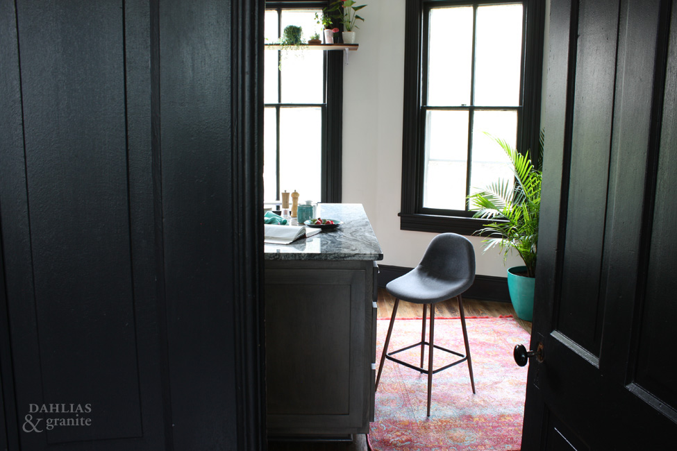
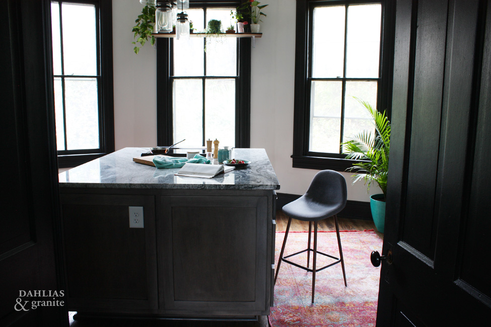
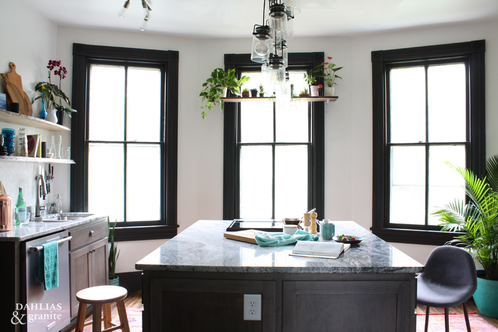
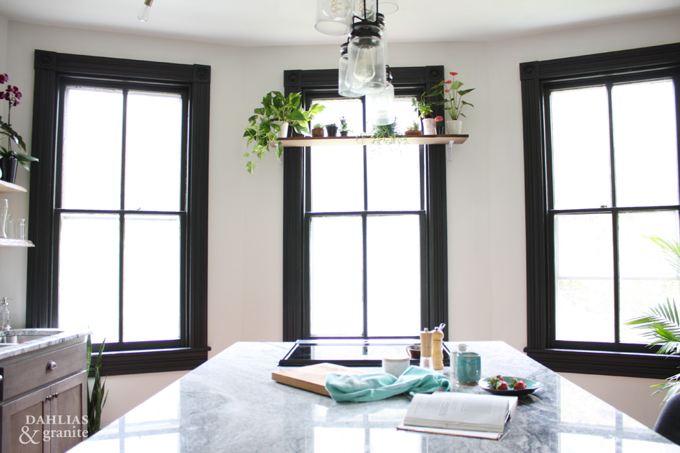
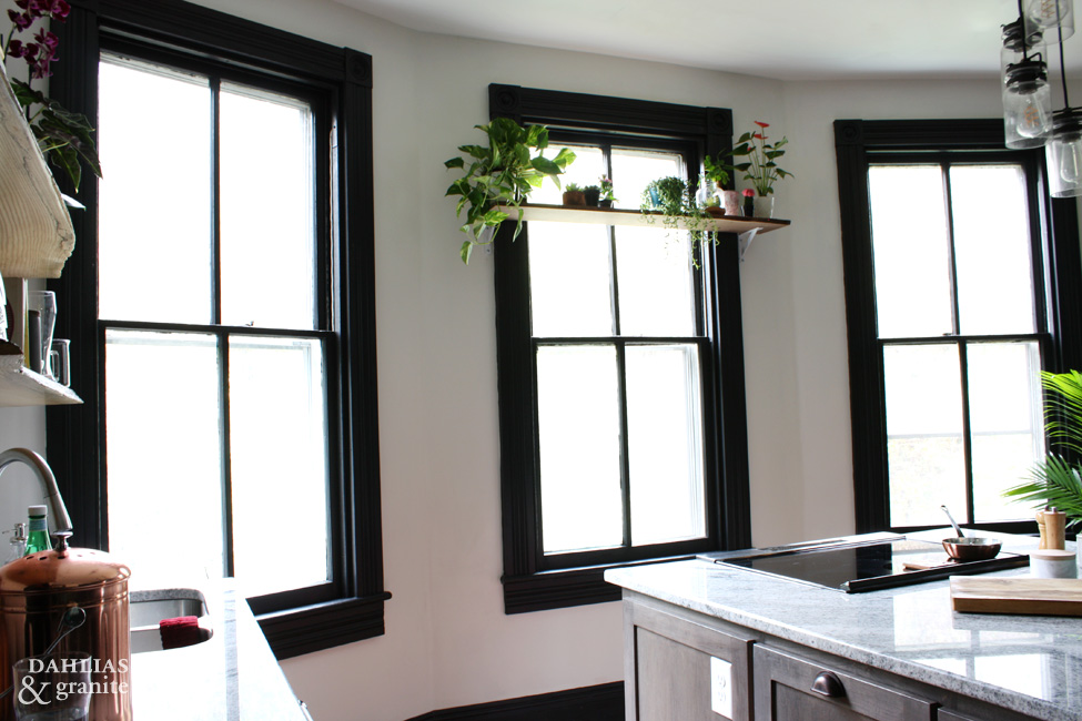
I could sit in this kitchen and stare out the windows for hours.
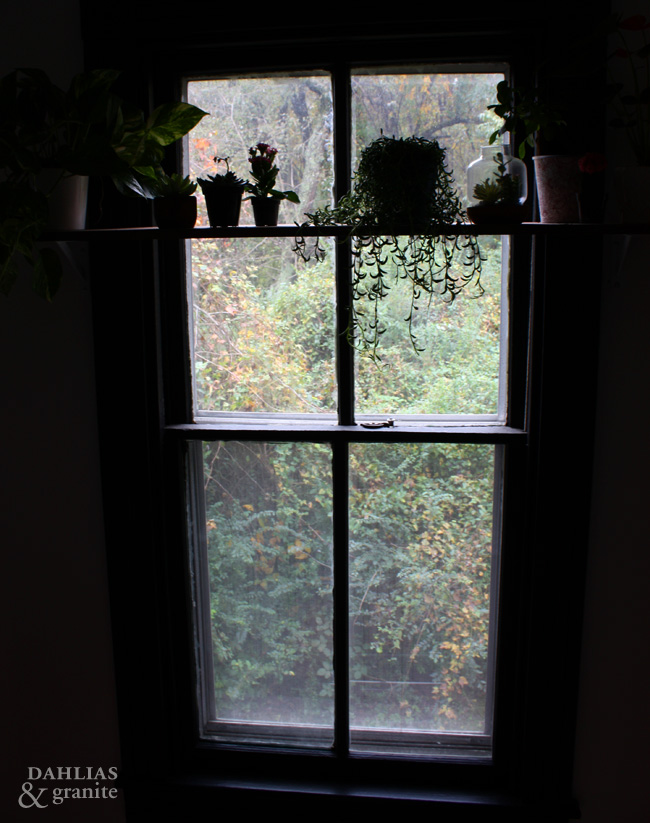
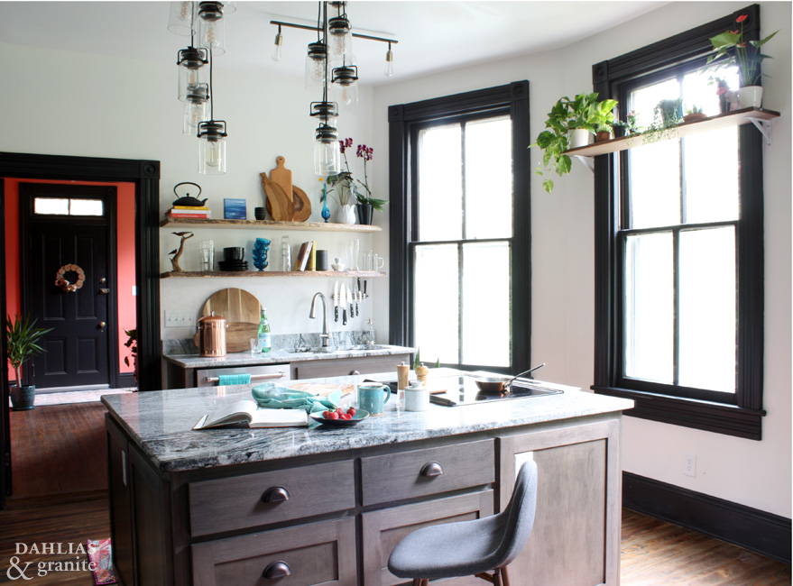
The white walls, natural materials and plants give the room a Scandinavian feel. The pendant lights still need to be moved over. That’s a long story for another post!
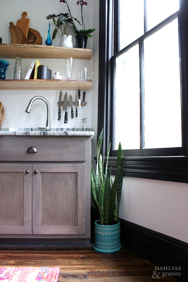
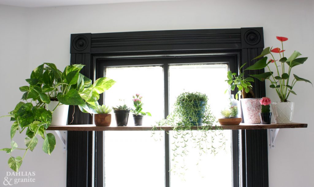
An opportunity arose for a plant nook where the bay window juts out.
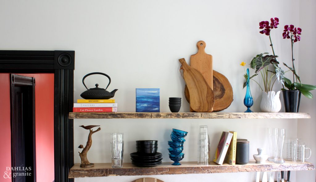
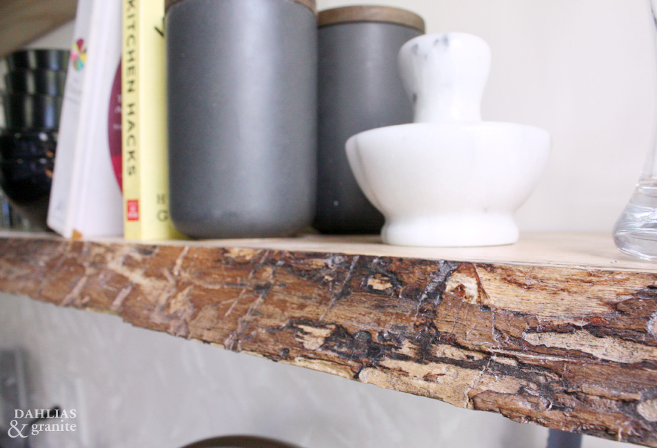
I chose this slab of ash to make the shelves out of because of the worm eaten edges. We have similar worm marks in our floors and carrying this pattern into something new helps keep it in character.
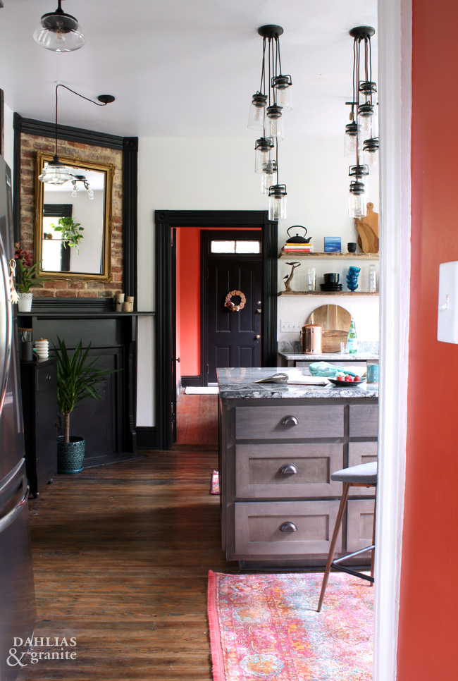
If you remember the second post in this One Room Challenge™ Series, there are three entryways in this kitchen. Though each room connecting to the kitchen is its own separate entity, to provide a feeling of flow and continuity, the rooms need to relate to one another.
The bright salmon entry is definitely a statement! As you walk into the kitchen you’ll notice the rugs, plants and books picking up that colour. This relates the white and black kitchen back to the entry so that they feel as though they belong together even though they are designed to have a different impact.
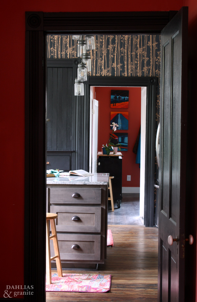
Here is what the kitchen looks like from the front entry.
There is a clear line of sight into the laundry/mudroom at the back of the home.
The front door is painted a vibrant teal and you’ll find this brilliant blue as an accent in all of the rooms on the first floor helping to create a cohesive colour scheme. The orange colour on the visible laundry room wall complements the salmon of the entry.
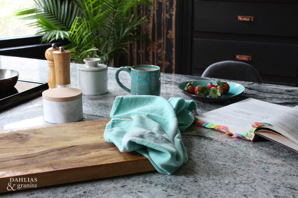
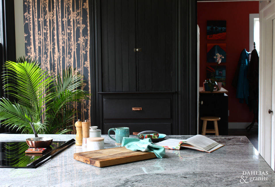
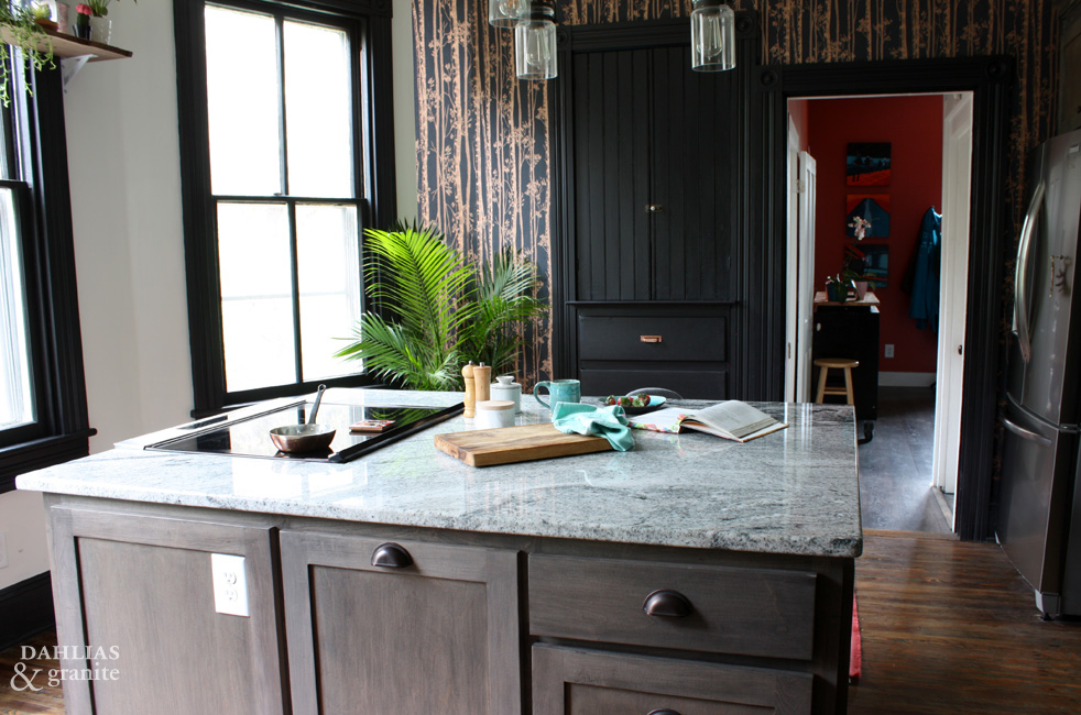
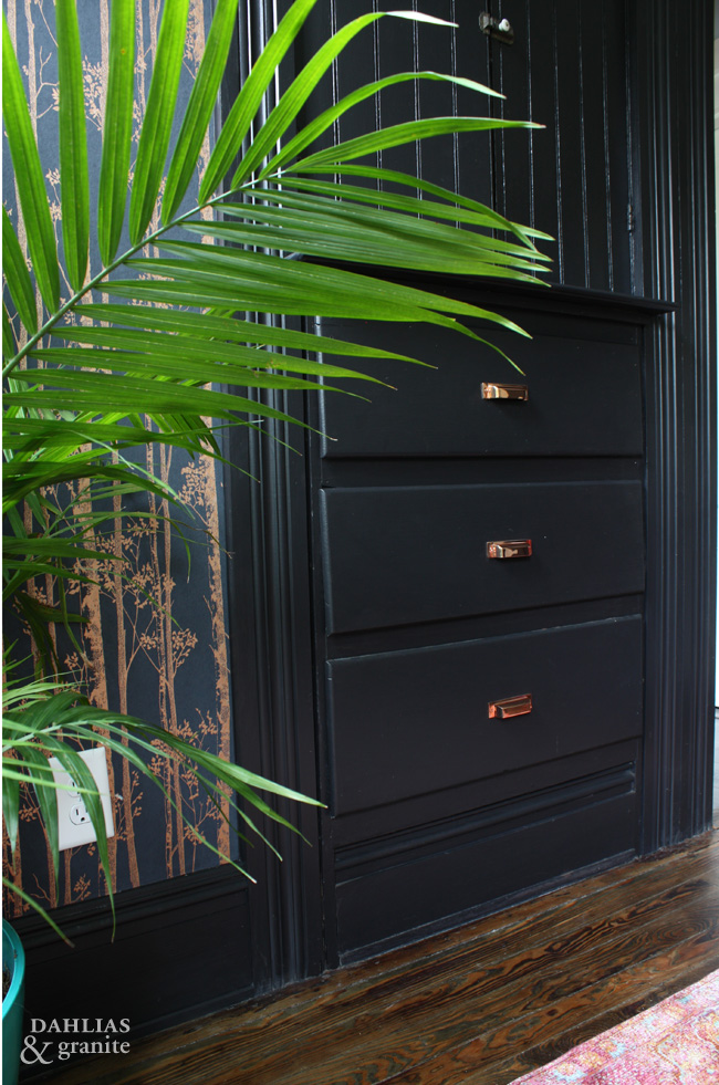
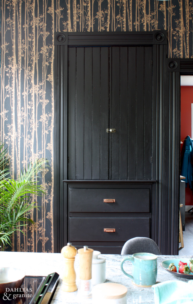
I have added copper pulls to this original built in pantry and the copper on the wallpaper really pulls this wall together.
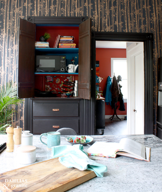
We don’t often use the microwave, so putting it into the pantry was perfect!
The built in pantry also has a passthrough that goes to the walk-in pantry. The colourful cloth is hiding the square hole because I didn’t want you to be distracted by the mess that is hiding back there! Once the walk in is complete, I’ll open the peekaboo hole up and you’ll be able to see right through.
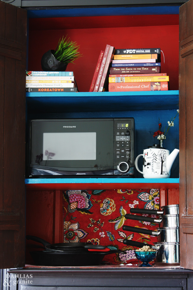
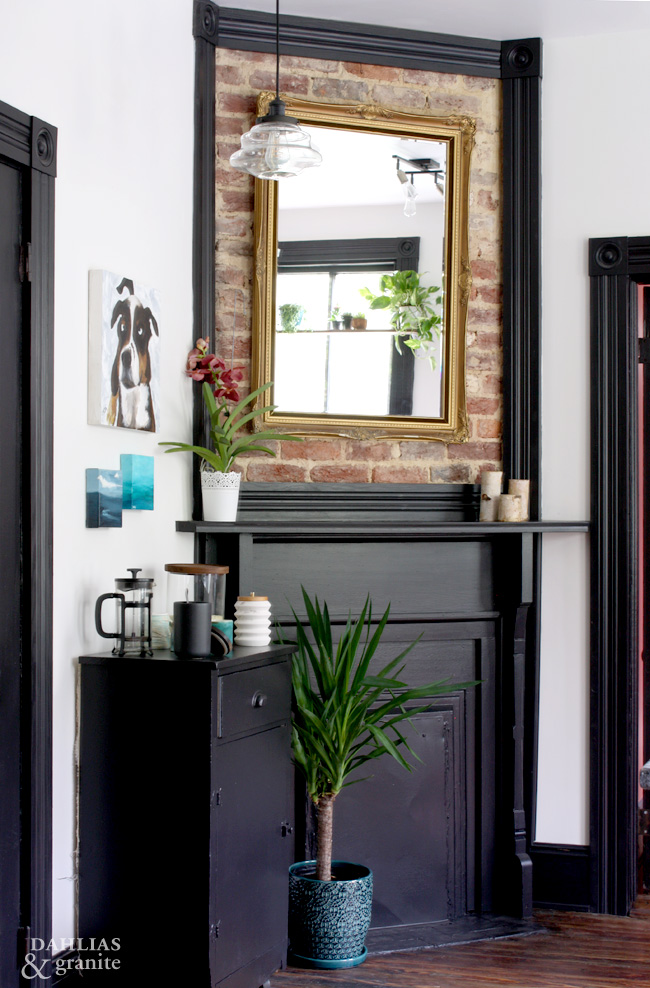
If you look closer at the details you’ll find many mentions of what makes us feel at home; the Canadian teapot in the pantry, the painting of my very first dog Jules who has long since passed, the cookbooks that we’ve collected over the years featuring adventurous cooking and materials that bring us joy.
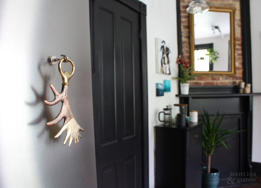
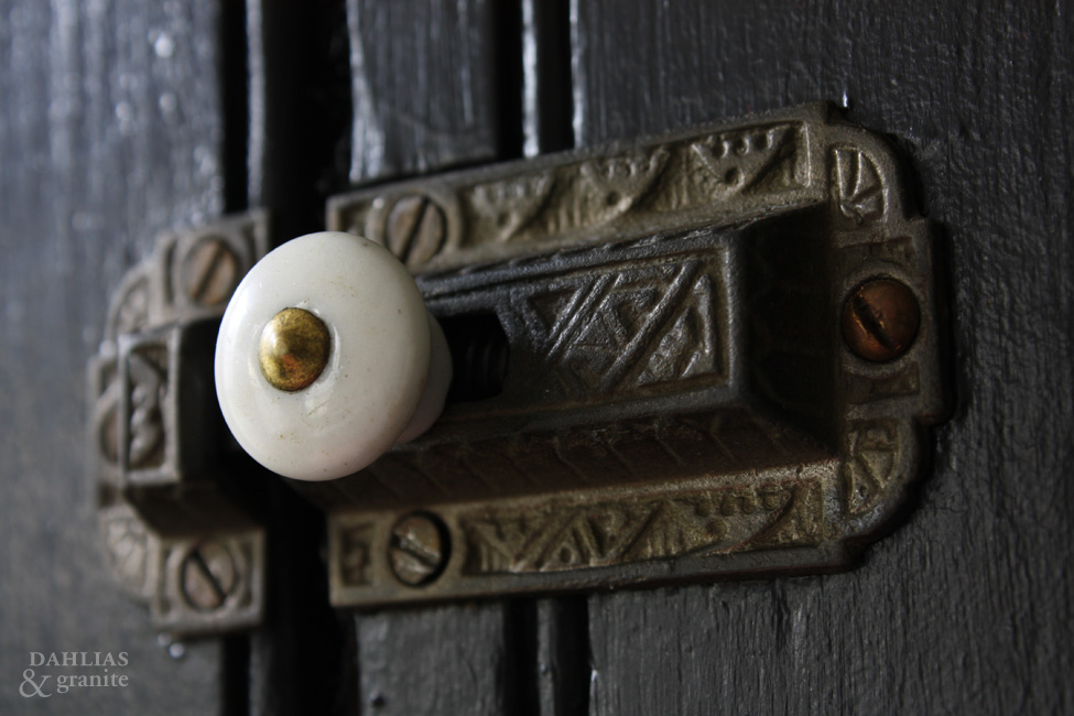
A huge part of the charm of this house is the original features, like this Charles Eastlake latch that is on our pantry doors. We have similar original hardware on our front door and Eastlake inspired fireplaces in other rooms of the home.
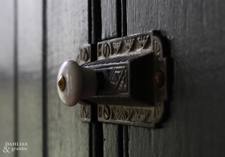
While we have modernised this kitchen with updated wiring, plumbing and appliances, a lot of thought and consideration went into making sure to preserve the history this house offered us. We’ve kept all the porcelain door knobs, as much of the original wood as possible and re-created what was damaged. We love the old (mostly original) windows and will not be replacing them with vinyl or any such tragedy!
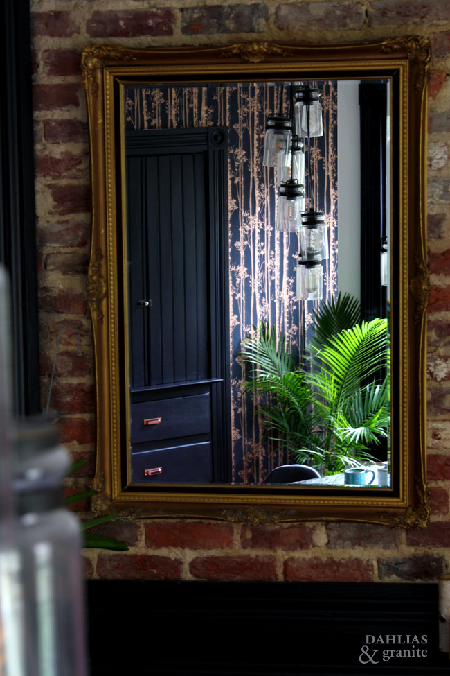
My perspective is a home isn’t ALL about the looks. It really needs to consider how each person uses the space and what elements to include to ensure that you enjoy your life being at home in your home.

O-Ren and Mags say they like their new kitchen too!
—
That’s it for the Fall 2018 One Room Challenge™.
I’d like to thank Better Homes and Gardens, as they are the official media sponsor as well as Linda Weinstein for starting and continuing the One Room Challenge™.
Candis & Andy, from Home Love Network are scouting the guest participants and two will be selected by Better Homes and Gardens to participate as featured designer during the next round.
This was my first time participating as a guest and I am hooked! This was a motivating kick in the pants to finish the details and write about the process. I personally find it easier to speak about the work I do for my clients than the work I do for my own home. Thank you to all of my readers and commenters, I’ve really enjoyed the process and I hope you’ve enjoyed it too!
Don’t forget to check out what the selected designers and other guests are up to in the One Room Challenge™.

Did you miss previous posts in this series? Check them out here.
Week 1 – Adding a Kitchen – The Before
Week 2 – Kitchen Layouts and Plaster Dust
Week 3 – Electrical, Plumbing and HVAC
Week 4 – Walls, Floors and Trim
Week 5 – Cabinets, Counters and Lights
Oh wow! So spectacular! I love the feel and charm of your new kitchen. That wallpaper is amazing! I just redid my kitchen and put the microwave in the pantry too. I am trying to eliminate it entirely from our lives. I am amazed how much less we use it now that it takes a few more steps to get to it. Haha
Thank you so much Veronica, I really appreciate your comments. It’s true, the farther you put something the less you are to use it!
Oh wow! That kitchen looks totally amazing. The work you’ve put in on it really paid off. It’s stunning.
Thank you so much Stacie. I really appreciate your kind words.
You’ve created such a beautiful space. I love the way the light just floods the room, and your choices work perfectly together.
Thank you Colleen, what a difference to where it started!
I like what you did with all the original wood work and tying all the rooms together. Great job to both you and Sean.
Thanks for all your help, Dad!
Hi Lora, what a beautiful space you have created! All the lovely details that you have kept, your colour choices, the delightful accents everywhere are inspiring. The photos are so artfully done. Congratulations! Hugs Joan
Thanks so much Joan. I appreciate you following along too!
Oh my gooooooshhh!!! Stunning!!! All of the thought put into the lines of vision are super impressive. Your surfaces are styled exquisitely. That wallpaper looks incredible on the pantry wall with the black wood & copper. Wow. It all jives so beautifully. Congratulations Lora!!!!
Thank you Gina for your lovely rave review 🙂
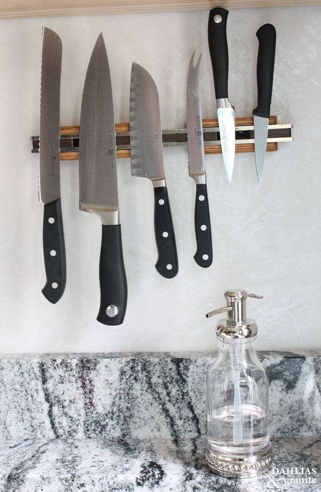
Wow what a beautiful kitchen! I could gladly make a mess in there daily. I love the magnetic knife strip
The knife strip is great as it keeps the knives off the counter!
Stunning! You made the right decision with the wallpaper. I love your original hardware. I would love to have a house with so much history. You did a great job. This was my first ORC and I might be hooked too.
Thank you Nicole, I had a couple of challenges with the wallpaper I didn’t mention, but I was thrilled that it turned out the way it did! See you in the next ORC!
What a lovely space! You did an excellent job designing it!!
Thank you Nikole
You are incredible with this vision!!! I love it! & you are also my new friend who loves wallpaper like I do!!! All these choices, textures, colors, & feels! I would never leave my house 😂
Thank you Leah! I’m happy to hear you appreciate all the details too.
This all looks amazing! One little thing I noticed that was so cool was the magnetic knife holder. Now I need one!
The magnetic knife holder is awesome as it doesn’t take up valuable counter space!
I love how it turned out! It looks really amazing!
Thank you for your kind words, Toni!
Wow how gorgeous! Looks so very amazing. i can’t wait to redo our kitchen some more!
Thanks, Jeanine
Absolutely fabulous Lora! Glad I had the privilege of seeing a bit of it a last month…..excellent choices! You have a wonderful eye for detail. Love that you put a bright color in the mud room. ( not done when we visited)
Look forward to our next visit and seeing what your next vision is💗
Thanks so much for commenting here on the post, it’s definitely made some progress! 🙂
Before, I wished I had a bigger kitchen. Now, I wish I had one as big and beautiful as this Victorian kitchen! A true homemaker’s dream!
Thank you Kristine.
I love everything about your kitchen. It looks so homey and lovely. I can imagine how happy it makes you feel to be in such a happy room. Great work!
Yes! It does feel happy and alive in here. Thank you Stacy.
We are currently purchasing a folk Victorian, coming from a mid-century modern! I’m looking for inspiration on mixing modern with Victorian, which your kitchen remodel reflects to me. Any “aha” learnings you can share about his approach?
Hi Lynn,
thanks so much for your comment — I would say that my biggest aha is to keep and or re-use as much as the original house as you can. Folk Victorian is streamlined enough that MCM would pair nicely together, but I would go a little understated on the MCM to pull the two together.
I do, virtual consults if you’d like additional assistance. Congrats on your new, old, home!!
What a beautiful room – I adore the windows! Lovely details too.
The windows are one of my favourite details too!
Those dark, rich colors are so exciting! Great job!
Thank you!
That’s lovely, you’ve done a brilliant job. I love the wallpaper with the copper detailing and it’s great that you’ve been able to retain some original features too.
Thank you for your kind words Rachel.
Love the rich deep colors and how you used them with contrasting black trim! So fun to see such beautiful color!
Thank you Carolyn, Aren’t the rich colours fun?
The black trim gives it such a dramatic feel! I love this. Well done!!
Thank you Emma, I do love to add a little drama!
Wow! Amazing kitchen design! I would really want to have one of these in the future!
Thanks Emman!
I love how it’s dark and moody yet light and bright at the same time! You did a terrific job. Most importantly, you know I’m a sucker for dogs, and I have an Aussie myself! So you just bumped up a couple extra notches in my book. (wink) Here’s to the next challenge!
Thank you Christine! I didn’t know you had an aussie, aren’t they the best?!
Truly beautiful kitchen space. I feel an Eastern Asian influence (color schemes/prints) that gives it a warm ambiance. High fives!
I love the rich and dark colors, and all the beautiful light. This is so stunning and inspiring!